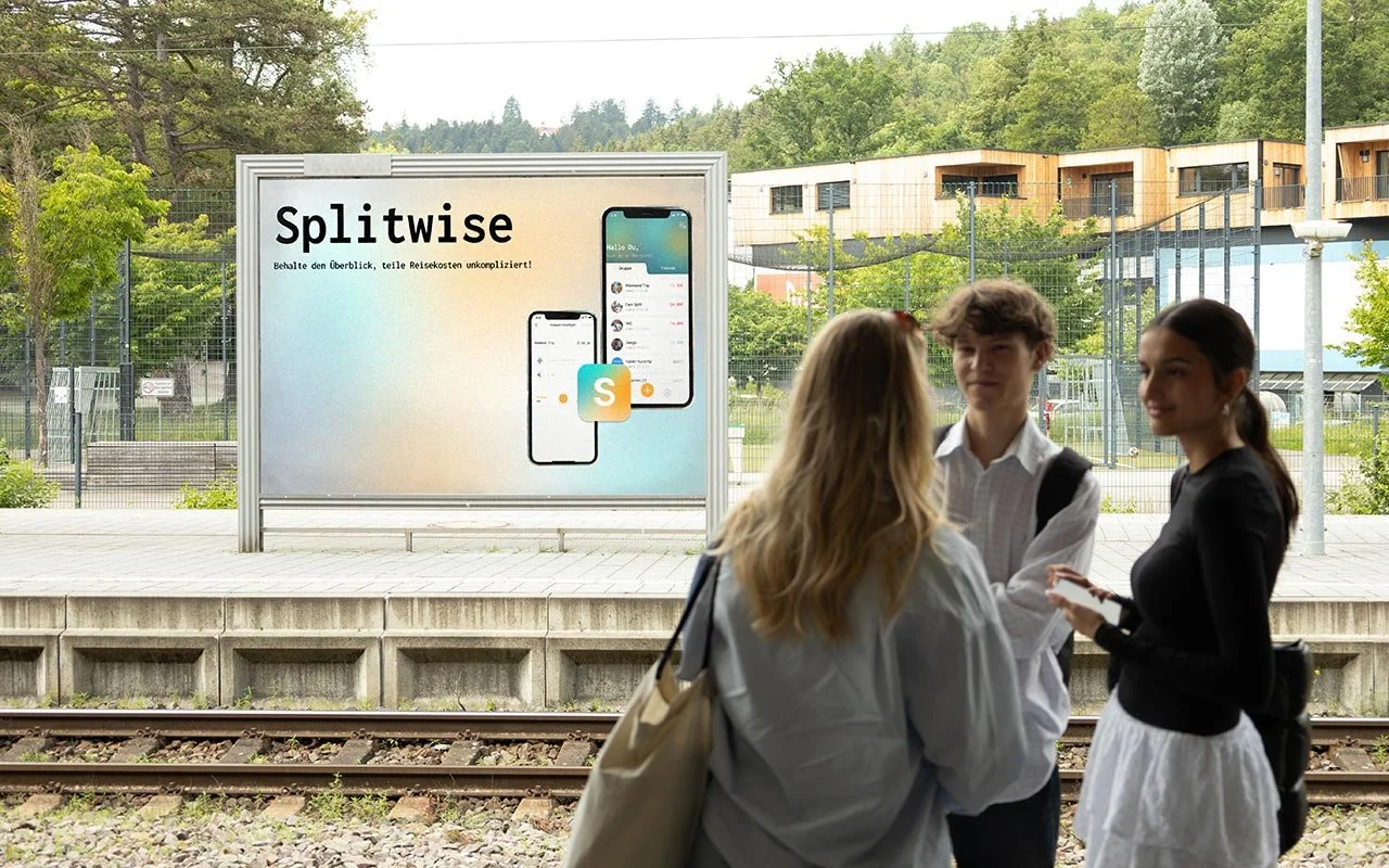
SPLITWISE REDESIGN
[application redesign ]
Splitwise addresses common problems and needs that many people face, managing shared expenses. While Splitwise offers many useful features, our own experiences have shown that there are areas where usability and functionality could be improved.
Team: Lea Dannenhauer, Gregor Baars
Duration: 4 months
My role: Research, Visual Design, Prototyping, Video
[ANALYSIS PHASE]
We analyzed the existing Splitwise app and documented the screen flow. During this process, we identified unnecessary features such as the the note board. At the same time, we recognized potential improvements in features like inviting friends via QR code and scanning receipts.
Additionally, we conducted a competitive analysis to inspire new features, such as in-app payments and automatic currency conversion. To assess the value of existing and potential features, we applied the Kano model, helping us prioritize based on user satisfaction and necessity.
[USER RESEARCH]
Our target group consists of individuals aged 16 to 45 who regularly share expenses. We conducted interviews with 10 former Splitwise users to identify their needs and frustrations with the app. From these insights, we created personas to better understand their goals and to develop "How Might We" questions to guide our design process.
How can we make the topic of money more approachable? How can we offer a long-term solution for expense tracking? How can we provide an easy way to quickly document expenses? With these questions in mind, we moved into the concept phase to develop a better solution.
[CONCEPT DEVELOPMENT]
We developed a detailed information architecture to plan the structure of the app and to accommodate all the content we wanted to add or improve. Using this framework, we sketched initial wireframes to test various layout options.
To get a better understanding of user interactions and flow, we created storyboards, which also helped us generate new ideas that we may implement in the future.
[DESIGN PHASE]
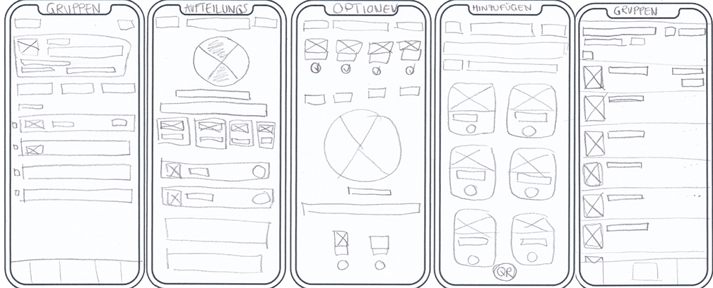
low fidelity wireframes
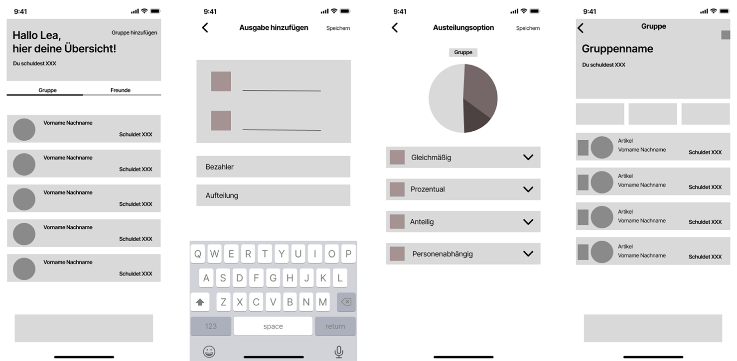
Figma wireframes
trying out design variants
styleguide
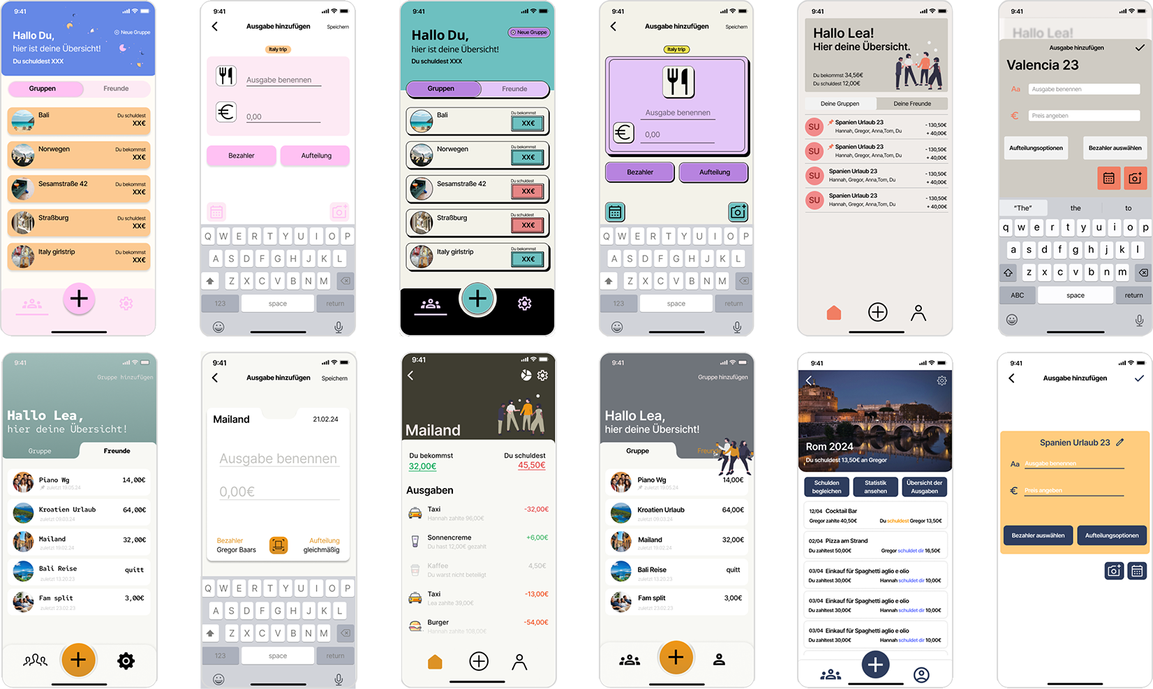
[FINAL SCREENS]
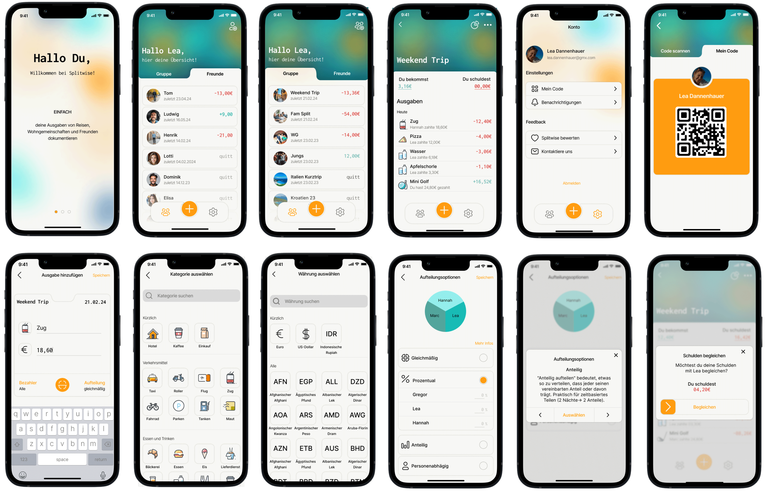
[FINAL PRODUCT]
[GROUPS/FRIENDS]
When you open the app, your groups and friends are organized into two categories for easy navigation, with the option to pin important groups at the top. Within each group, expenses are automatically balanced, categorized by type and payer, keeping finances organized.
[ADD WITH QR]
When creating a group, you can invite members by selecting them from your contacts or scanning someone’s QR code, making it simple for everyone to join.
[CREATE A NEW EXPENSE]
When you create a new expense, you can set a name that will be automatically categorized with an icon. You can also change the currency, which will be converted to your preferred currency. Additionally, you can select the payer involved and choose from various splitting options to manage the expense distribution.
[SCAN RECEIPT]
To make entering expenses easier, you can scan a receipt, which will be automatically analyzed and entered into the app. Afterwards, you can adjust the payer and the split as needed.
[SETTLE DEBTS AND REMINDERS]
You can pay off your debts using in-app payment features. Additionally, the app allows you to remind group members about the debts they owe you, ensuring everyone stays informed about their financial obligations.
MORE PROJECTS
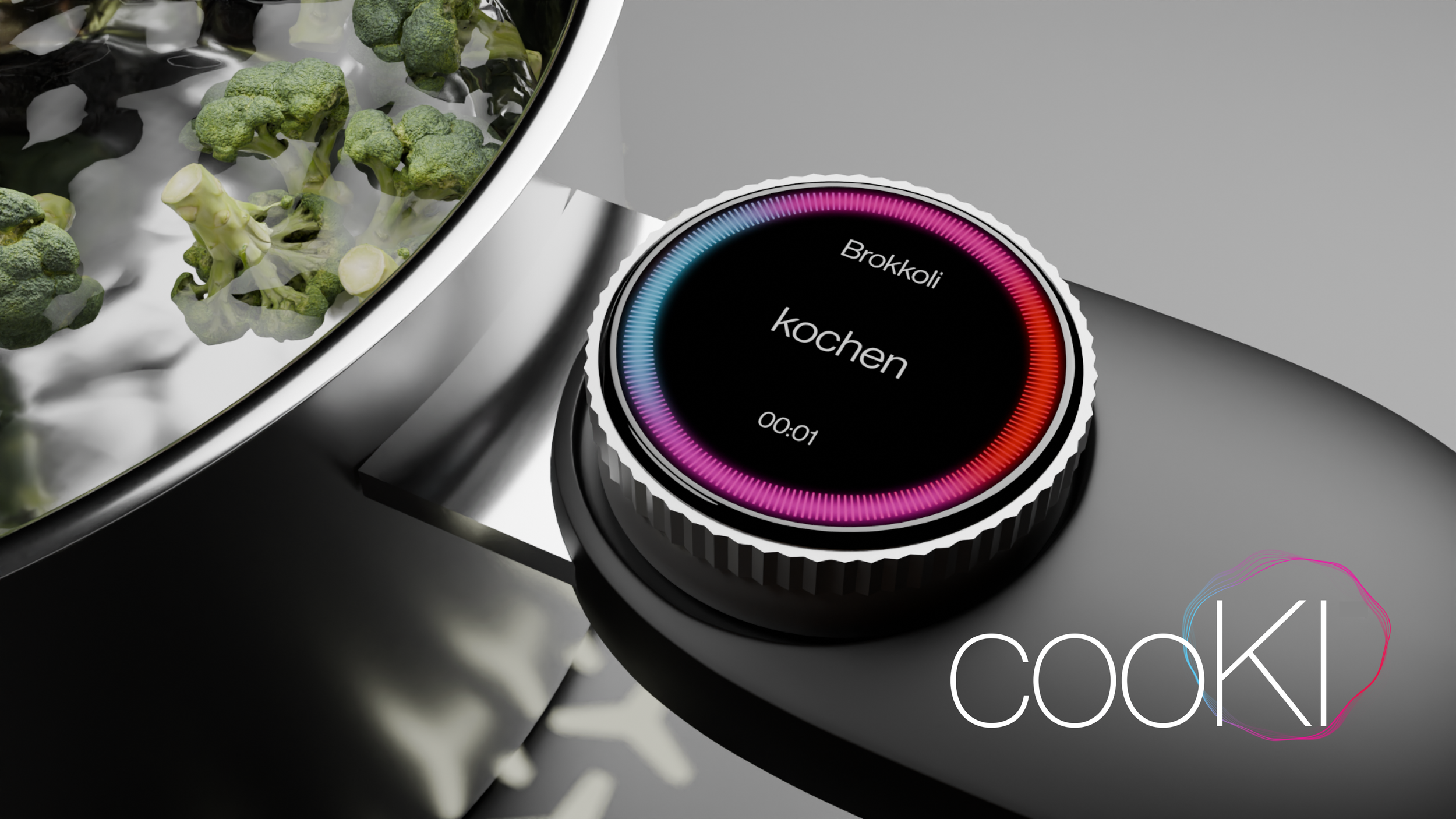
COOKI
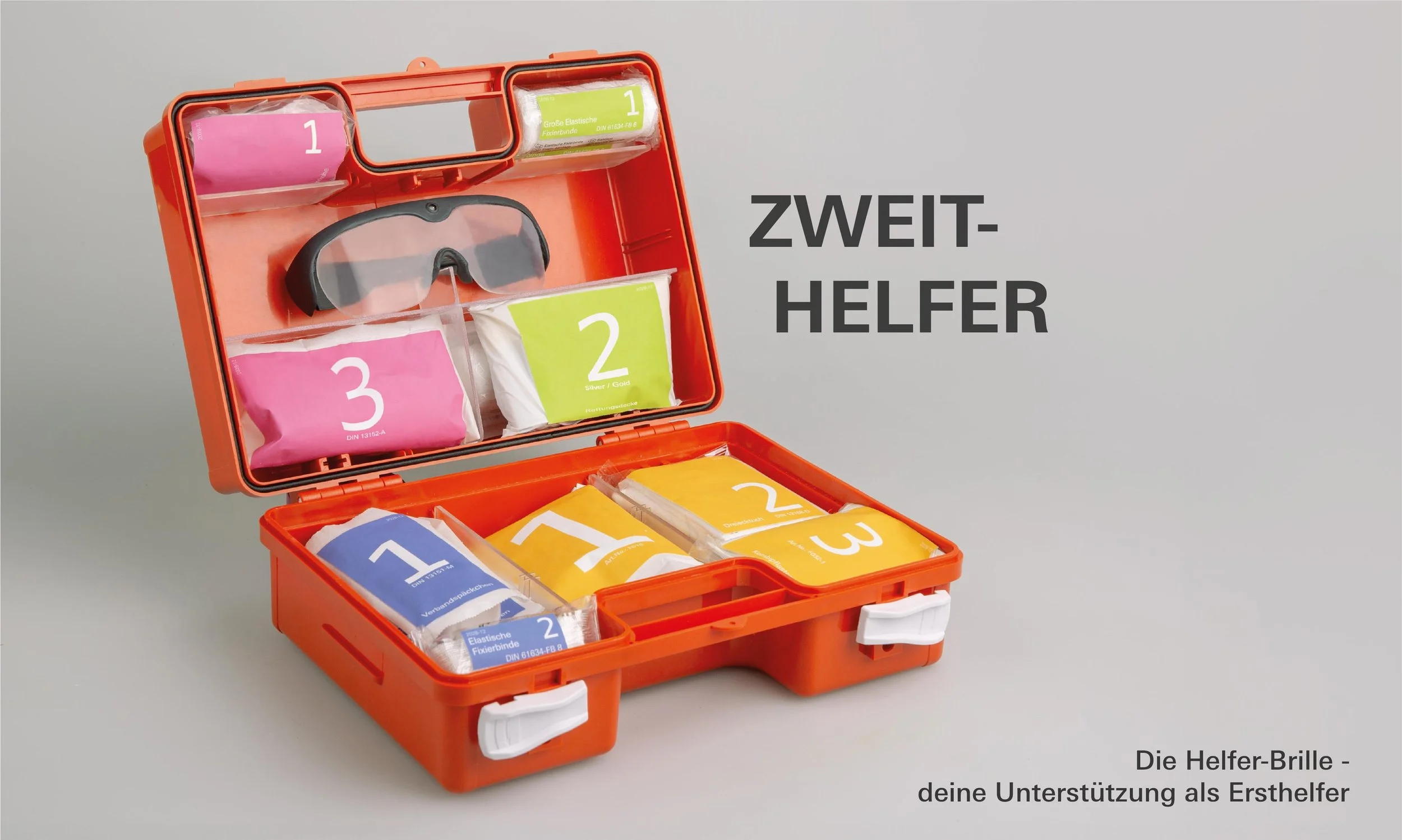
ZWEITHELFER